Thursday, March 7, 2013

no good.

Harry Potter!  This is pointed pen Italic with white acrylic ink on gray Me Tienes paper.


Thursday, February 7, 2013

your little dog too.

One of my favorite lines from Wizard of Oz.  I wrote in Roman capitals with a ruling pen, then used a pointed pen and flourished capitals all done in walnut ink.  


Wednesday, January 30, 2013

so many books.

I love to read, and completely agree with the below.  


Tuesday, January 22, 2013

time for a promotion.

A quote from one of my favorite movies, Devil Wears Prada.  Nigel spoke such true words about work/life balance.


Thursday, January 17, 2013

hello gorgeous.

Over the next few months, I'm going to be posting some fun quotes with lettering, ink color, and paper that are a little bit different.  


Monday, January 14, 2013

thankful.

Starting 2013 with a bang and I'm....


Wednesday, May 2, 2012

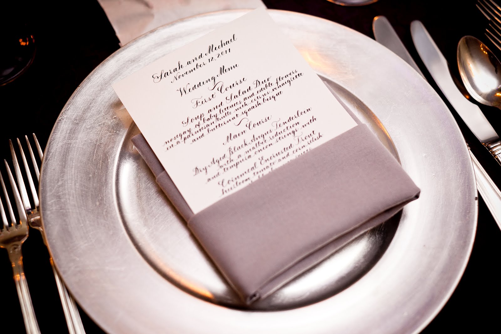
Menu Cards

I really enjoy doing menu cards. This one for was one of my favorite brides of last year! Her wedding was at Meridian House and it was absolutely stunning.


It's a very simple process. Clients send me their menu text, I draft a copy of it, scan it, and then send it to them to have printed on individual cards. It looks very pretty and is a fraction of the cost of hand writing each menu!

Wednesday, March 21, 2012

Dazzling Details!

I'm so excited to have been asked to be a part of The Dazzling Details Wedding Bazaar!

Come see me there, I'll be demonstrating and making something special for each bride to be!


New Year's Eve Menu

I had a fun opportunity to do a menu card for a very special New Year's Eve Dinner honoring Martin Ginsburg. The client sent me a copy of a menu from a White House dinner that they asked me if I could replicate. This was one of those instances where I definitely couldn't replicate the font, so I went with the closest that I could. They also asked that I do a fun "motif" of some sort at the top. The sunburst ended up being the perfect option representing both the quirkiness of "Marty" Ginsburg and the New Year.

Thank you notes


I've been playing around with some thank you note options on brown kraft paper. They are flat cards, with a small Thank you in the lower right corner. Clean and simple.

Finally a Facelift!!

Finally, my blog and website have gotten a bit of a facelift to go with the new branding of AW Calligraphy. There will be new posts soon with some new projects I've been working on! Check it out www.walkercalligraphy.com!

Wednesday, October 12, 2011

New Font Sample

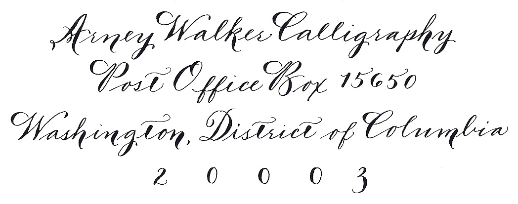
I've been working on rebranding Arney Walker Calligraphy. I'm still in the early stages, but part of that was that I wanted to have my own return address either stamp or label. I decided to use my new font for it. Stay tuned to see how it gets used in real life!

Monday, September 19, 2011

FINALLY.....some new fonts

Since IAMPETH, I've been practicing my Spencerian to get it ready to use regularly. I've been working on it for about a year now, but never quite felt comfortable with doing it for a client. I recently had the opportunity to use it for a client on their rehearsal dinner envelopes and it turned out beautifully.

I also had another opportunity to do what I'm now going to call swashy Spencerian (or number 4 on the new font list below) which was basically an adaptation of Spencerian with some additional shading and the difference in height between the upper and lower case was not as great as it is in traditional Spencerian.

I've also added what is basically copperplate script but done vertically instead of at a slant (see font 2).

Can't wait to use these more!

Wednesday, August 17, 2011

Wedding Photos


I'm taking a little break from the IAMPETH blogging to bring a few photos from the wedding that I both planned and did the escort cards for.


These are photos from my camera, so definitely not high quality, but you get the general idea. It was a stunning wedding and they used white Crane enclosure envelopes and cards as the escort cards. I custom mixed a periwinkle ink to match the bridesmaid's dresses.


Friday, August 5, 2011

VA Vineyard Wedding on SMP!

This was an incredibly fun wedding to do calligraphy for because I used a font that I developed based on a combination of Foundational hand and a Crane's font.

And, it was all done in orange ink!


I did an escort card board, as seen here in the main post on Style Me Pretty, and buffet labels, and some chalkboard signs as well.

Lots of spectacular details designed by Allison Jackson of Pineapple Productions!

AW Calligraphy on Style Me Pretty!

I had the great fortune to work with a good friend of mine on her wedding in MA last Labor Day weekend. She had a lovely theme of apples going through the entire wedding and asked me to do apple escort cards, chalkboard menus, some signage and some other decor items. I had a blast doing it!


I also did the planning for this too! I was thrilled when Style Me Pretty chose this fabulous wedding for their Little Black Book Blog.

Spencerian Monograms

I know I posted about this once, but I had to post another.

I seriously loved this class. It helped that it was taught by Michael Sull, but I just generally had a really great time learning how to do this.

I made a bunch of monograms. Here's my sister and her huband's.


This is something that is going to be added into my repertoire asap!

Engrossing for Beginners

OH boy. If I thought the watercolors class was bad, the Illumination class was even worse. Dreadful in fact.

Which means that this will be a very short post.

This is what Illumination is supposed to look like.

This is what mine looks like.


There's more but I'm too embarrassed to show it. :)

Contemporary Pointed Pen and Exciting Florals

This class highlighted the fact that I have close to zero artistic skills. Or more accurately, that I have the artistic skills of a third grader.

I chose this class because I wanted to learn the font that was being taught. It was a much more modern and loose looking font than I typically use and I thought it would be far enough out of my comfort zone to be fun.

Unfortunately, we started with the "Exciting Florals" part of the class. Which included watercolors. Not like the ones that you use in third grade, real ones. Barbara Close taught us about how to create an iris and rosebuds using different brush strokes. I dissolved into hysterical giggles more than once during this part. When she came around to look at our work I told her that I felt like mine looked like a kindergarten art project. She said, "Well, maybe not kindergarten, but definitely elementary school." HA! The woman sitting next to me said that she probably would have done better with crayons than with the watercolors.

Once we got to the exemplar (set of letters), I was feeling more in my element and really enjoyed writing with this much more relaxed hand.

Beginning Spencerian

I cannot tell you how much I love Michael Sull. He's my calligraphy idol. I've said this before, but I have his DVDs, his books and just purchased his brand new book on American Cursive Handwriting while I was at the convention.

I've never taken one of his Spencerian classes so I was super excited about the chance to watch him teach Spencerian. Unfortunately, we didn't get terribly far, just through lowercase and a few capitals, but it was so worth it.

I started out a little scribbly with letters here and there.


I then started writing some names out.


My mom doesn't think that Spencerian is the most legible of the hands that I write, but I happen to like it. I'm almost at the point where I can work it into my regular font rotation.

THIS JUST IN: I actually just started a set of rehearsal dinner envelopes that are written in Spencerian. Will definitely scan a few in to show when I'm all finished!