
Wednesday, October 12, 2011
New Font Sample
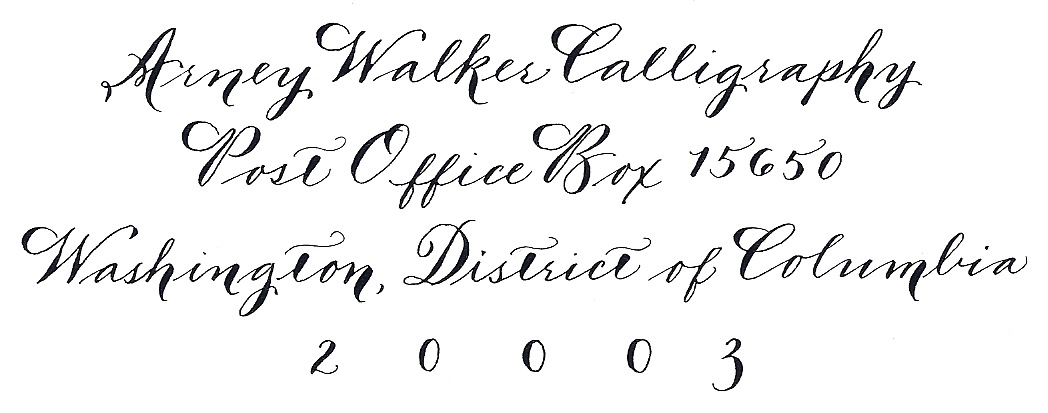
I've been working on rebranding Arney Walker Calligraphy. I'm still in the early stages, but part of that was that I wanted to have my own return address either stamp or label. I decided to use my new font for it. Stay tuned to see how it gets used in real life!

Monday, September 19, 2011
FINALLY.....some new fonts
Since IAMPETH, I've been practicing my Spencerian to get it ready to use regularly. I've been working on it for about a year now, but never quite felt comfortable with doing it for a client. I recently had the opportunity to use it for a client on their rehearsal dinner envelopes and it turned out beautifully.
I also had another opportunity to do what I'm now going to call swashy Spencerian (or number 4 on the new font list below) which was basically an adaptation of Spencerian with some additional shading and the difference in height between the upper and lower case was not as great as it is in traditional Spencerian.
I've also added what is basically copperplate script but done vertically instead of at a slant (see font 2).
Can't wait to use these more!

Wednesday, August 17, 2011
Wedding Photos

I'm taking a little break from the IAMPETH blogging to bring a few photos from the wedding that I both planned and did the escort cards for.

These are photos from my camera, so definitely not high quality, but you get the general idea. It was a stunning wedding and they used white Crane enclosure envelopes and cards as the escort cards. I custom mixed a periwinkle ink to match the bridesmaid's dresses.

Friday, August 5, 2011
VA Vineyard Wedding on SMP!
This was an incredibly fun wedding to do calligraphy for because I used a font that I developed based on a combination of Foundational hand and a Crane's font.
And, it was all done in orange ink!

I did an escort card board, as seen here in the main post on Style Me Pretty, and buffet labels, and some chalkboard signs as well.
Lots of spectacular details designed by Allison Jackson of Pineapple Productions!
And, it was all done in orange ink!

I did an escort card board, as seen here in the main post on Style Me Pretty, and buffet labels, and some chalkboard signs as well.
Lots of spectacular details designed by Allison Jackson of Pineapple Productions!
AW Calligraphy on Style Me Pretty!
I had the great fortune to work with a good friend of mine on her wedding in MA last Labor Day weekend. She had a lovely theme of apples going through the entire wedding and asked me to do apple escort cards, chalkboard menus, some signage and some other decor items. I had a blast doing it!

I also did the planning for this too! I was thrilled when Style Me Pretty chose this fabulous wedding for their Little Black Book Blog.

I also did the planning for this too! I was thrilled when Style Me Pretty chose this fabulous wedding for their Little Black Book Blog.
Spencerian Monograms
I know I posted about this once, but I had to post another.
I seriously loved this class. It helped that it was taught by Michael Sull, but I just generally had a really great time learning how to do this.
I made a bunch of monograms. Here's my sister and her huband's.

This is something that is going to be added into my repertoire asap!
I seriously loved this class. It helped that it was taught by Michael Sull, but I just generally had a really great time learning how to do this.
I made a bunch of monograms. Here's my sister and her huband's.

This is something that is going to be added into my repertoire asap!
Engrossing for Beginners
OH boy. If I thought the watercolors class was bad, the Illumination class was even worse. Dreadful in fact.
Which means that this will be a very short post.
This is what Illumination is supposed to look like.
This is what mine looks like.

There's more but I'm too embarrassed to show it. :)
Which means that this will be a very short post.
This is what Illumination is supposed to look like.
This is what mine looks like.

There's more but I'm too embarrassed to show it. :)
Contemporary Pointed Pen and Exciting Florals
This class highlighted the fact that I have close to zero artistic skills. Or more accurately, that I have the artistic skills of a third grader.
I chose this class because I wanted to learn the font that was being taught. It was a much more modern and loose looking font than I typically use and I thought it would be far enough out of my comfort zone to be fun.
Unfortunately, we started with the "Exciting Florals" part of the class. Which included watercolors. Not like the ones that you use in third grade, real ones. Barbara Close taught us about how to create an iris and rosebuds using different brush strokes. I dissolved into hysterical giggles more than once during this part. When she came around to look at our work I told her that I felt like mine looked like a kindergarten art project. She said, "Well, maybe not kindergarten, but definitely elementary school." HA! The woman sitting next to me said that she probably would have done better with crayons than with the watercolors.
Once we got to the exemplar (set of letters), I was feeling more in my element and really enjoyed writing with this much more relaxed hand.

Beginning Spencerian
I cannot tell you how much I love Michael Sull. He's my calligraphy idol. I've said this before, but I have his DVDs, his books and just purchased his brand new book on American Cursive Handwriting while I was at the convention.
I've never taken one of his Spencerian classes so I was super excited about the chance to watch him teach Spencerian. Unfortunately, we didn't get terribly far, just through lowercase and a few capitals, but it was so worth it.
I started out a little scribbly with letters here and there.

I then started writing some names out.

My mom doesn't think that Spencerian is the most legible of the hands that I write, but I happen to like it. I'm almost at the point where I can work it into my regular font rotation.
THIS JUST IN: I actually just started a set of rehearsal dinner envelopes that are written in Spencerian. Will definitely scan a few in to show when I'm all finished!
The Artful Flourish
So, let's just say that I'm not a flourisher. I had attempted many times to make some pretty pictures with my pen but had failed each and every time to do more than a little squiggly line. This was the main reason that I picked Heather's class.
I was incredibly nervous starting out. I'm used to writing so this was very out of the box for me. Heather started with very basic concepts and basic strokes, just compound curves. She then introduced a concept that was truly what helped me to "get" flourishing and that was the one of the most important things was to move the paper as you were writing. Sounds so simple, but I had never done this before. And when I started moving the paper, things started to make sense.
We did two "projects" that I really enjoyed. The first was a flourished Christmas Tree. This will definitely make an appearance this Christmas as my holiday card.

The next was a flower/flourish combo with colored pencils and my new most favorite item, Fin Tec gold paint. The look is incredibly Victorian, which is what Heather is inspired by, but I actually really like it.

I'm not sure that I'll use flourishing in my everyday work, but the class was absolutely worth it.
IAMPETH 2011
This week and next, I'm going to blog about my trip to the Annual IAMPETH Convention.
Last year I attended my first IAMPETH convention in Orlando, FL. It was a great time and I learned a lot. I left already excited for the next year's convention. This year's convention was held in Phoenix, AZ. I've never been to Phoenix, so I was excited to go, even though it was supposed to be in the 110's all week long.
I was able to stay at a friend's home, which was fabulous because it gave me some time to decompress and she has a pool. :)
This year I took a completely different approach to picking the classes that I wanted to attend. They were offering three different classes during each session offering a wide variety of options. Last year, I chose classes based on what I thought was marketable to clients. This year, I chose classes that were completely different than anything I had ever done before and some new things that I wanted to try.
Day 1, I took a class called The Artful Flourish, taught by Heather Held. Day 2, I took Beginning Spencerian with Michael Sull in the morning, and a class on learning to format names on escort cards and envelopes by Nan DeLuca. Day 3, I took Contemporary Pointed Pen and Exciting Florals with Barbara Close in the morning and did a class on how calligraphy and technology are merging, complete with iPad apps and how to best use Photoshop Elements. Day 4, I did a class on Illumination by John Fraleigh in the morning and then Spencerian Monogram Design with Michael Sull in the afternoon.
It was a jam packed week and for someone who isn't used to sitting at a desk and learning all day long, it took a lot out of me. I met some new people, saw some people I had met last year and just generally had a great time.
Over the next few days, I'll be posting some samples of my work from the classes. Guaranteed to be entertaining at the very least.
Monday, August 1, 2011
Monograms

So I just got back from the IAMPETH convention in Phoenix and it was fabulous!
I went last year to the Orlando conference and it was great, but this was a lot different. I made a point to make sure to take classes where I'd do something completely different than what I usually do. That meant watercolors (disasterous), illuminating (only slightly better) and a whole lot of flourishing.
My most favorite class, and also the very last one, was the Monogram class that Michael Sull taught. Last year, I loved his Sickles Alphabet class so I figured I'd enjoy monograms too, but I had no idea just how much fun I'd have. Michael has a true gift of being able to teach in a way that makes total sense (to me at least). I've always wanted to do monograms and have struggled through creating some on my own, but the way that Michael taught this, made it so easy. It's based in Spencerian capitals rather than Copperplate capitals, which could be one of the reasons that it made more sense.
Above is my own monogram. I'm contemplating having it turned into a tattoo. :) Or maybe just my new logo when I re-brand AW Calligraphy.
Feature on Style Me Pretty!
I'm so thrilled that my work was featured on Style Me Pretty today! It was a really fun shoot to do with my good friend Alison Hathaway of Red Shoes Photography, and our friend Natalie was also our model.
I designed the shoot as Pineapple Productions, and did the calligraphy for it too. I did a set of menus, with the names of the guests written on belly bands that went across the center of the menu and addressed the envelopes for the Save the Date.
Special thank you also to Maria Canelis at Meridian International Center, Philippa Tarrant of Philippa Tarrant Floral Design, Liz Waylan at DC Rental and The Sweet Lobby.
Style Me Pretty Post.
Tuesday, March 8, 2011
At Work
My good friend Alison Hathaway, of Red Shoes Photography, recently came over to take some photos of me while I was working. I loved her action shots.

I also liked her close up of my pens. My dad asked why there was a pen that goes out at a strange angle. It's an oblique pen holder that I use for any of the pointed pen script fonts that I do. It holds the pen nib out at an angle so that you get a nice slant to your work without having to turn your hand at a strange hard angle.

Thanks Alison!
Saturday, March 5, 2011
Menu Cards
I've done several different menus recently. The first below is for the same wedding that I did the baseball cards for. This is a great example of a menu where I did the template and then scanned it into a pdf and then had it printed from the pdf.

The next is a menu that I did in a folded booklet style. The bride's mom came up with the folded design, it was done on Crane's paper to make a 5"x5" square with a title on the outside and the menu on the inside.


The next is a menu that I did in a folded booklet style. The bride's mom came up with the folded design, it was done on Crane's paper to make a 5"x5" square with a title on the outside and the menu on the inside.

Tuesday, March 1, 2011
Baseball Labels
I recently did a wedding at the Corcoran for a fabulous couple. The bride loves navy and pink and so the whole thing was navy and pink. In order to give the groom a little bit of a his own touch at the wedding, we worked in a small baseball theme.
The cake had a baseball coming out of the top layer. To go with it, I created these baseball labels for the late night snacks. I wrote in thick and thin font and hand stitched the corners to look like stitches on a baseball. I was thrilled with the result and so were the bride and groom!

The cake had a baseball coming out of the top layer. To go with it, I created these baseball labels for the late night snacks. I wrote in thick and thin font and hand stitched the corners to look like stitches on a baseball. I was thrilled with the result and so were the bride and groom!

Monday, February 28, 2011
Website Facelift
A big thank you to Amy Mullen of Mint Parcel for helping me reformat and update my website. And another big thank you to Alison Hathaway of Red Shoes Photography for taking some new photos of my work and me doing my work!
I'm recommitting to my blog and going to update with some new ideas on a more regular basis.

I'm recommitting to my blog and going to update with some new ideas on a more regular basis.

Subscribe to:
Posts (Atom)